
One screen, three ways to discover Walkify
Overview
Walkify is a mobile app that makes walking more rewarding by allowing users to track their steps, earn rewards, and compete with friends.
During my time at Kree8 Studio, I redesigned its onboarding into a cleaner, swipeable experience that introduces the app's core features without requiring users to go through every slide before getting started.
- Walk
- Track your daily steps, follow your progress, and stay motivated by seeing how your friends are moving.
- Earn
- Turn your everyday steps into rewarding experiences and discover what you can earn by staying active.
- Compete
- Challenge your friends, compare your daily progress, and climb the leaderboard through competition.
- Walk
- Earn
- Compete


The challenge
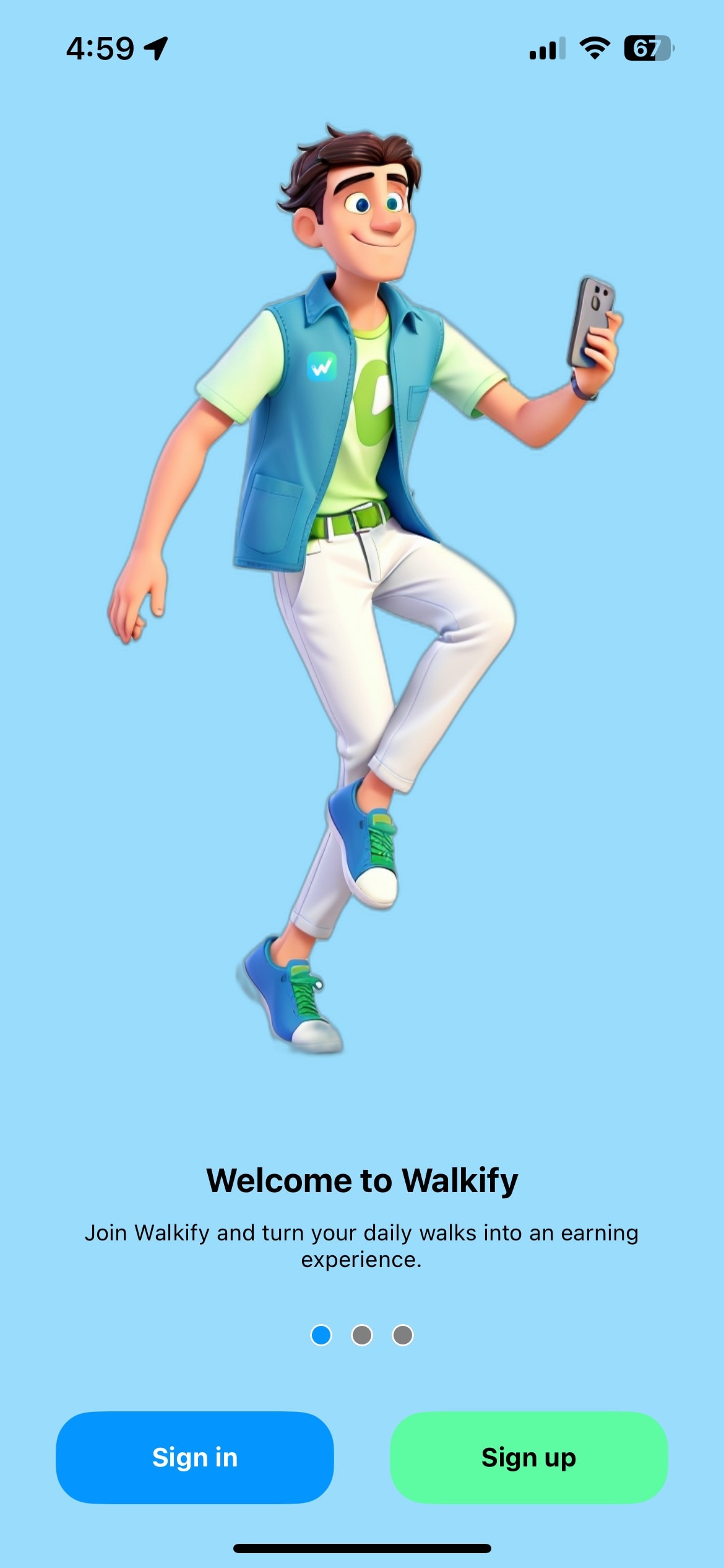
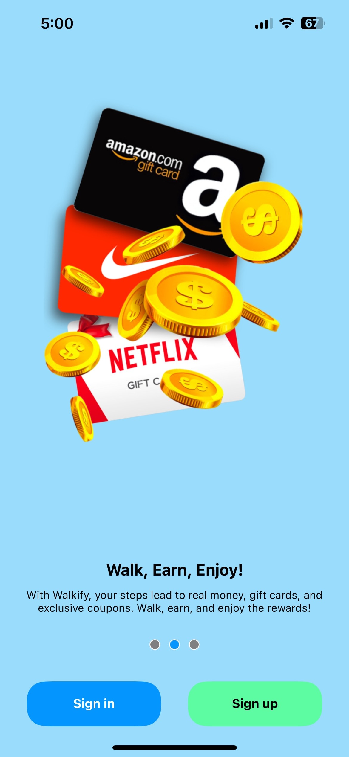
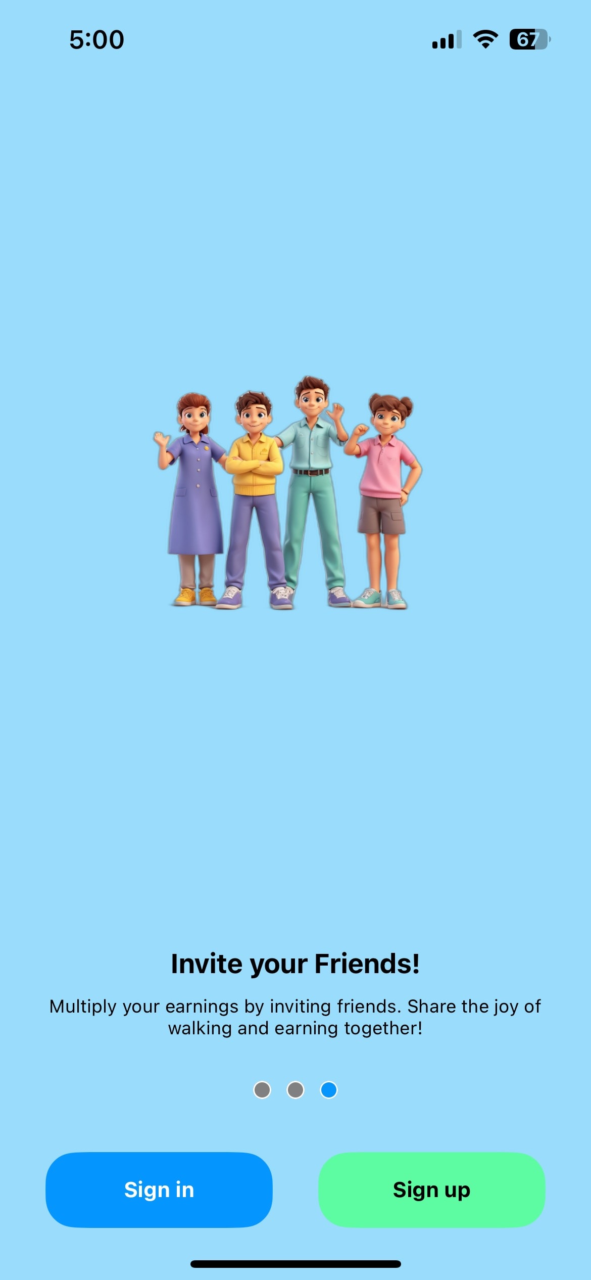
Walkify's original onboarding had a playful direction, but its 3D illustrations lacked polish and visual appeal. Combined with bright backgrounds, they dominated the screens without clearly showing what users could do within the app.
The challenge was to create a cleaner, more engaging introduction that communicates Walkify's features while keeping its fun and friendly personality. Looking at the original screens, three areas stood out as needing improvement:
- Illustration heavy visuals
- Large decorative illustrations dominated the screens, leaving less emphasis on the actual product experience.
- Limited product context
- The onboarding introduced key benefits without clearly showing how users would experience them within the app.
- Visual hierarchy
- The original layouts could better emphasize key messages and create a clearer separation between content and actions.
The approach
I approached the redesign with a focus on less decoration and more meaningful storytelling. By simplifying the visual hierarchy, I wanted to make Walkify's core features easier to understand from the first interaction.
Instead of relying on decorative 3D illustrations, I explored more product-focused visuals that better communicate how the app works. Three principles guided this direction, helping each slide serve a clear purpose while keeping the overall experience consistent:
- Clearer hierarchy
- Simplifying layouts to make key information easier to scan and understand.
- Product-focused visuals
- Using meaningful visuals that reflect the experience inside Walkify.
- Visual consistency
- Creating a cohesive experience through consistent typography, spacing, colors, and layout.
- Clearerhierarchy
- Product-focusedvisuals
- Visualconsistency


The redesign
The new onboarding brings Walkify's core features into one swipeable experience. Each slide highlights a different benefit while keeping the layout and account actions consistent.
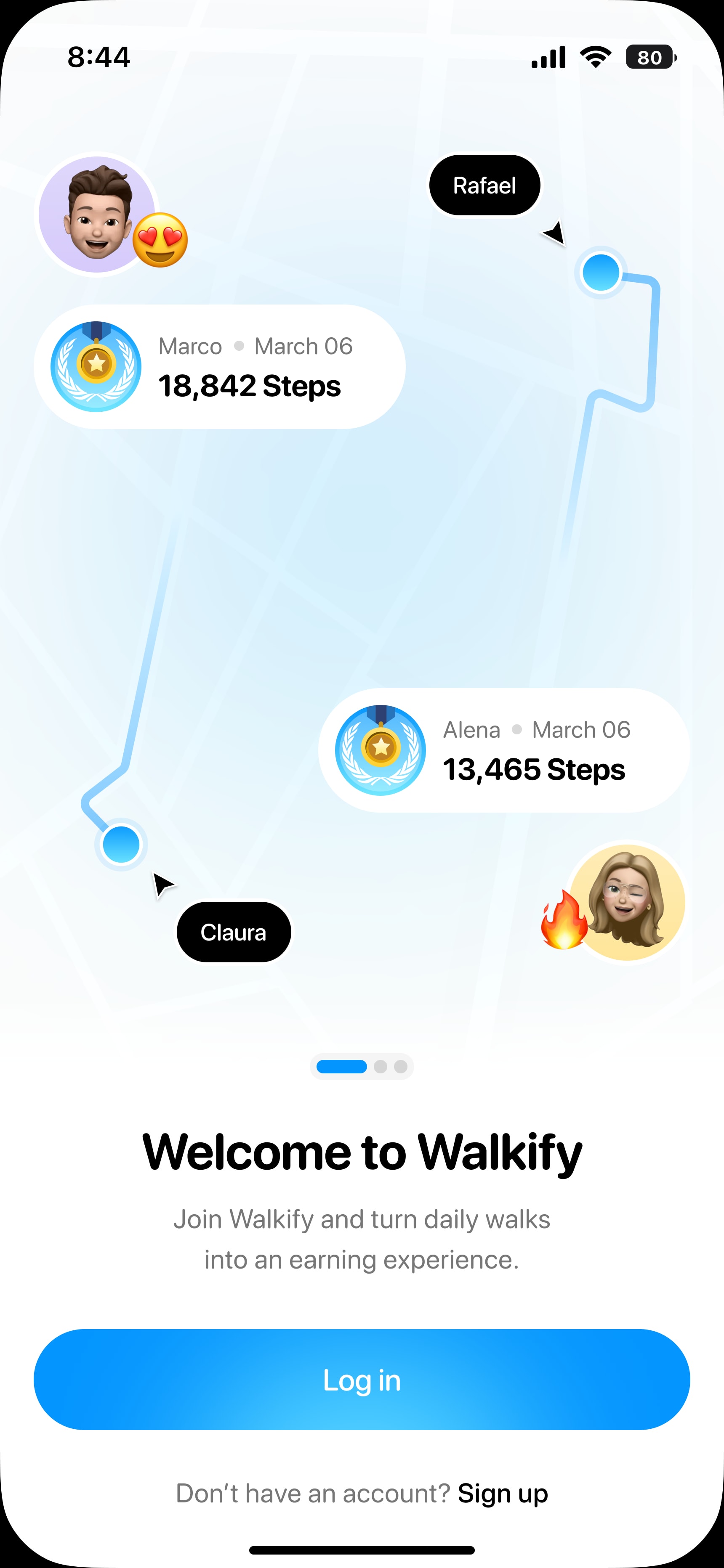
Walk. Make every step count.
The first screen moves away from the original character illustration and introduces a more contextual view of walking routes, daily steps, and friends' activity. Rather than just telling users about walking, the new visual gives them a glimpse of what they can actually track and explore in Walkify.
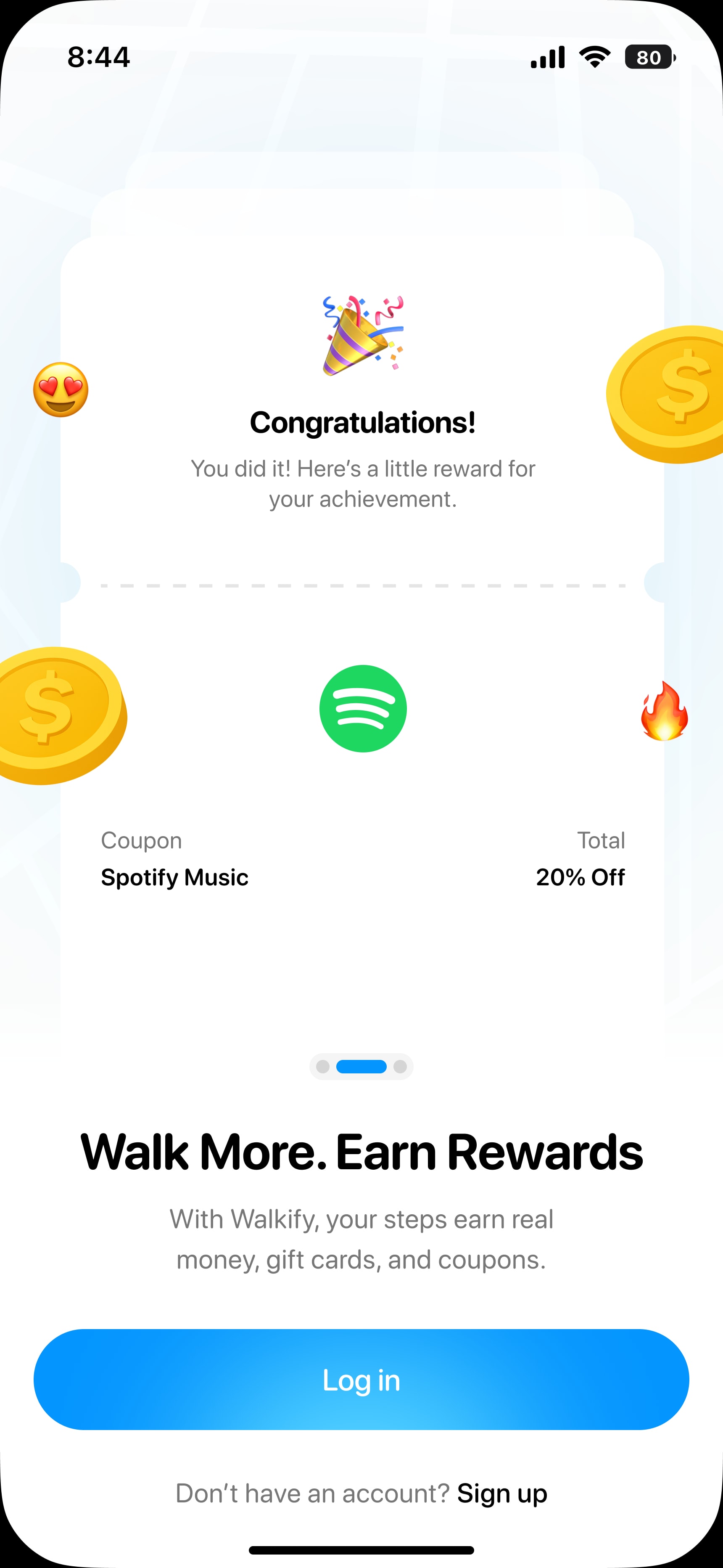
Earn. Make rewards feel real
The second screen replaces floating gift cards and coins with a more recognizable reward experience. By showing a celebratory moment alongside an actual reward example, the design makes the connection between staying active and earning something feel more tangible.
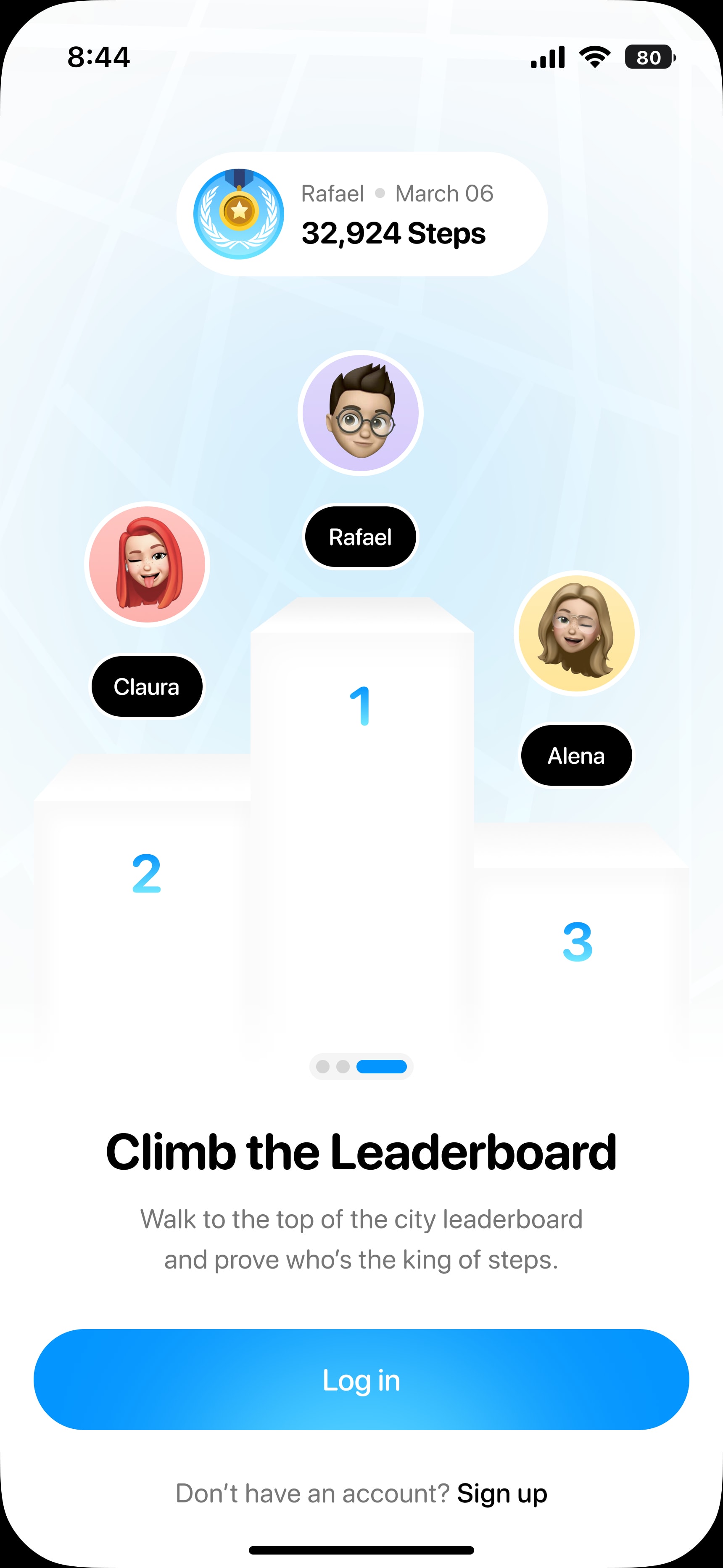
Compete. Make walking more social
For the final screen, I shifted the focus from inviting friends to friendly competition. A leaderboard with rankings and progress gives users a clearer sense of how they can challenge each other, adding a social element to their everyday walks.
Outcome and reflection
The final redesign introduces a cleaner, more consistent onboarding experience with visuals that better represent Walkify's features. The designs were delivered through Kree8 Studio and approved by the client.
This project reminded me that good onboarding doesn't need to be complicated. Clear storytelling and thoughtful design choices can help communicate a product's value while giving users the freedom to get started.